Perry Lefko
When the Toronto Maple Leafs unveiled a retro third jersey for a few games this season, it immediately received a negative reaction from fans because it looked more like a grey and blue colour scheme than the traditional white and blue and subsequently had to undergo some changes.
Aside from the obvious fact the National Hockey League produces retro team jerseys to push sales, and the teams feel the need to create new designs every so often for various reasons, I believe sometimes they should leave things as they are and these marketing types should keep it simple.
In fact, I feel bad for NHL players who have to wear silly-looking uniforms designed by people who don’t play the game. I’d like to see hockey players design clothes for marketing people and see how comfortable – or more likely uncomfortable – they’d feel at work.
If you look at the NHL’s Original Six teams – Toronto, Detroit, Montreal, the New York Rangers, Detroit and Chicago – their designs today are similar to the original ones, which in my opinion were simple and effective, and they have stood the test of time.
If I was recommending one over the other, I’d take the Blackhawks’ crimson home jersey with the logo honouring Black Hawk, a native American leader. The team’s original owner named the team the Blackhawks – although at times it was changed to Black Hawks – to honour the U.S. Army infantry Black Hawk division he served in World War I. The unit was named after a leader of the Sauk Native American tribe during the Black Hawk War of 1832.
I had a Blackhawks’ white road jersey growing up and I’ve long since lost it or simply outgrew it and who knows where it is now. Bobby Hull, one of the Hawks’ greatest all-time players, has famously said he loved wearing the jersey with the logo that resembled the face of teammate Pierre Pilote. When the Hawks started a run of three Stanley Cup championships from 2010-2015, that jersey and logo burst into prominence. Think of Patrick Kane, Jonathan Toews and Duncan Keith in those jerseys. Man, what an image!
The Hawks, like other teams, have made changes to the look, but not enough to make you want to stand up and shout, “Go back to the old jerseys.”
The Blackhawks have come under fire from some critics who want the team to change the logo because they feel it is no longer politically correct and objectifies native Americans, but I’ll leave that debate for someone else. Yes, some franchises have been receptive to change – most notably the National Football League’s Washington franchise has dropped the nickname Redskins. If at some point the Blackhawks want to change their logo, so be it.
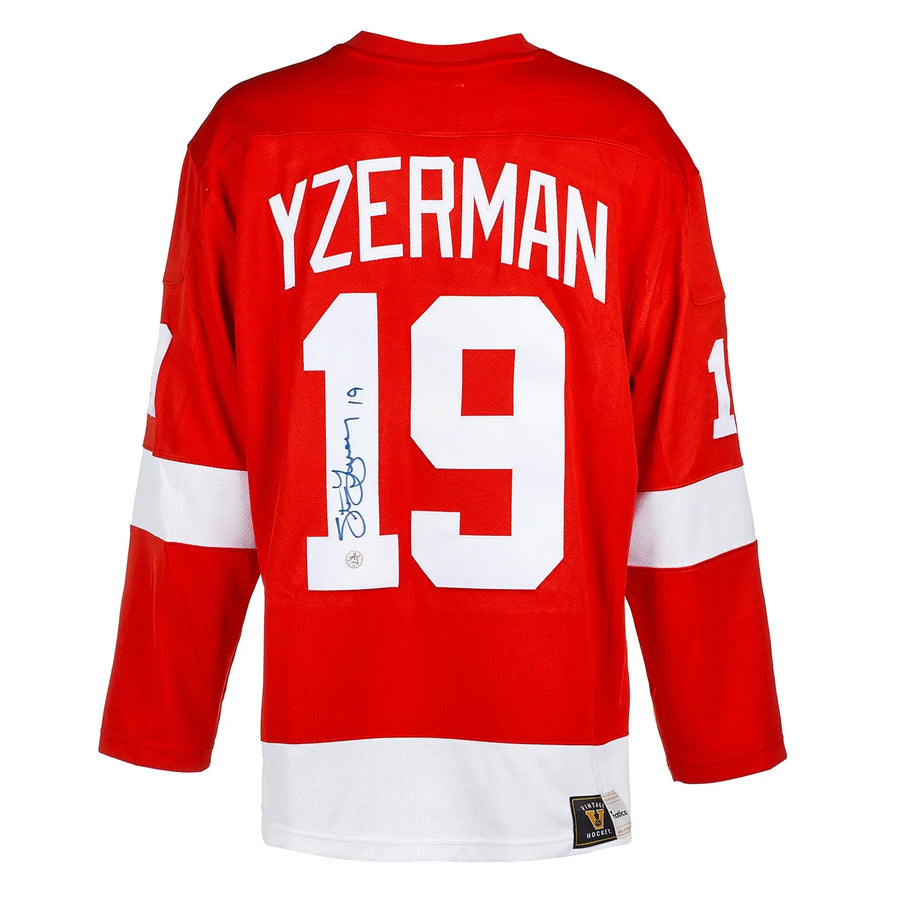
I also like the Red Wings simplistic design of a wheel with a wing. The Wings is a reference to the team’ previous name – Detroit Falcons – and the wheel is obvious. It is simple with the red and white colour scheme, similar to Toronto’s white and blue. The franchise had success with the likes of Gordie Howe, Sid Abel and Ted Lindsay in the 50s. And isn’t Lindsay’s nickname Terrible among the greatest of all time? He used his stick like a carving knife, but I digress.
The Wings started a consecutive playoff streak of 25 years from 1979-80 to 2003-04. The logo became prominent during Detroit’s four Stanley Cup wins between 1996-97 and 2007-08.
Then there is the Montreal Canadiens, who are often romanticized with their francophone bleu blanc rouge colours. They are affectionately called the Habs, short for Habitants, but that is somewhat misleading in terms of the jersey. The logo is a large letter C and an H in the centre. Collectively it stands for Le club de Hockey Canadien.
Despite the Leafs having gone without a Cup since 1967, their jerseys are still among the most popular in terms of annual purchases by fans. The Leafs are so entrenched in hockey history, they have fans throughout Canada who dress in their team jerseys in other teams’ buildings. Think Ottawa, for example. Interestingly, the story of why they are called the Leafs instead of leaves is one of those old saws referring to either a Maple Leaf Regiment from World War I or Conn Smythe, the principal owner of the Leafs from 1927-61, taking it from a team he once scouted called the East End Maple Leafs. One historian suggested there never was a Maple Leaf Regiment that fought in World War I. Any way, Smythe changed the team’s colours from green and white from when they were called the St. Pats to blue and white when he renamed the franchise. By the way, that retro Leafs green and white jersey worn around St. Patrick’s Day with the logo St. Pats is awesome. The reason? It’s so simple with the words St. Pats and a green and white colours design.
I love the Rangers’ design with the word Rangers diagonally displayed. Apparently the name relates to original owner Tex Rickard. The team became known as Tex’s Rangers, a play on the phrase Texas Rangers. When the Rangers won the Cup in 1994, ending a 54-year drought, the jerseys sold in huge numbers. I’m told by historian Mike Commito the Rangers logo was to differentiate the team from the New York Americans. Sounds okay to me.
Lastly, there is the Boston Bruins, or as they were known in the ‘70s as Bobby Orr and The Big Bad Bruins, and alternately called the B’s. The story goes that original team owner Charles Adams hired Art Ross as general manager and asked him to come up with a team name that represented an untamed animal displaying speed, agility and cunning. He came up with Bears, as in brown bears.
Is it a coincidence that some of the Original Six teams have become so successful in the past 20 years, winning six Cups? Or 10 in the last 30 years?
Lest I forget the Oilers and the New York Islanders. I think Edmonton’s logo with the word Oilers and oil drop is exceptionally strong in its simplicity, even more so when you think of Wayne Gretzky wearing it and now Connor McDavid. I think the Islanders’ logo with the letters N and Y with the hockey stick stands out. Maybe it’s because it represents the four consecutive Cup wins from 1980-83. Remember when the Islanders changed their logo to include their team name and a fisherman? It lasted all of two seasons before it was sent to the junkyard for sports jerseys. There is a book about it called We Want Fish Sticks: The Bizarre and Infamous Rebranding of the New York Islanders. That says it all.
I hope the Buffalo Sabres return to glory one day and stay with their original logo, the one with the bison and two crossed sabres. There’s been several iterations of it over the years, but the blue home jersey with the original logo is, in my opinion, one of the greatest of all time in NHL history.


